In the bustling world of advertising, where brands scream for attention and consumers grow more selective, there’s a rare kind of magic when a campaign cuts through the noise. In fact, it doesn’t happen by chance. For instance, behind every memorable ad lies a story—of vision, creativity, and the successful ad campaigns design secrets. So, today, we’ll journey through six iconic campaigns that didn’t just succeed; they shifted culture—because each one holds successful ad campaigns design secrets that helped shape its triumph.
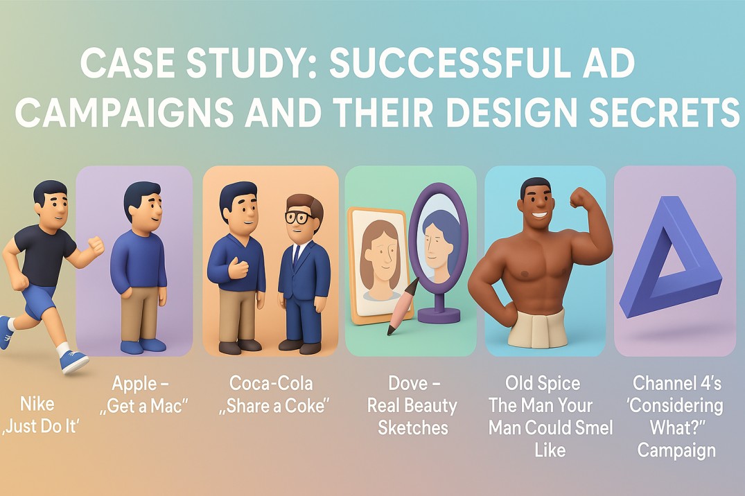
1. Nike – “Just Do It” (1988)
The Backstory: By the late ’80s, Nike was known in athletic circles but was losing ground to Reebok in the growing fitness boom. As a result, they needed a unifying campaign that could reach beyond pro athletes and connect with the average person striving for something more.
The Big Idea: “Just Do It” was born as a simple yet powerful rallying cry for everyone with a goal, no matter how small. In essence, it wasn’t just about shoes — rather, it was about empowerment.
The Design Secret: Minimalism made it iconic. A stark black-and-white palette, clean sans-serif typography, and bold negative space let the message breathe. Thus, the power of the words, set against raw imagery of real athletes, amplified emotional resonance.
The Execution: The campaign spanned TV, print, and billboards. For example, one early ad featured 80-year-old marathoner Walt Stack running across the Golden Gate Bridge, smiling. So, it humanized athleticism.
The Impact: Within a decade, Nike’s sales increased from $800 million to over $9 billion. Moreover, the phrase became part of pop culture, and the campaign is still referenced today as a masterclass in simplicity and strength.
2. Apple – “Get a Mac” (2006-2009)
The Backstory: Apple was steadily growing, but PC dominated the computer market. Therefore, Apple needed to differentiate itself clearly and charmingly.
The Big Idea: Enter Mac and PC: two characters representing the brands. The Mac was casual, creative, and cool; the PC was stiff, corporate, and outdated.
The Design Secret: Visual storytelling through characters in a minimal white void. For instance, no clutter, no distractions — just witty dialogue, clear contrast, and a clever personification of the brands. Typography was sleek, and Apple’s iconic design language subtly framed the narrative.
The Execution: The ads ran on TV and digital platforms, eventually spawning over 60 variations. Each was short, humorous, and easily shareable.
The Impact: Apple’s market share grew significantly, and the campaign helped redefine the brand as the go-to for creatives and casual users alike.
3. Coca-Cola – “Share a Coke” (2011)
The Backstory: Faced with declining sales among young adults, Coca-Cola needed to make the brand feel personal again. In Australia, they piloted a campaign that would soon go global.
The Big Idea: Replace the iconic logo with popular names on Coke bottles and cans — turning a mass product into a personalized experience.
The Design Secret: Typography was king. The classic Spencerian script remained, but names were custom typeset to blend seamlessly into the logo’s space. Red and white branding stayed intact, ensuring recognition even with the twist.
The Execution: Starting with 150 popular names, the campaign rolled out across TV, print, digital, and in-store displays. People shared bottles with friends, snapped photos, and sparked social media buzz.
The Impact: Coca-Cola saw a 7% sales increase in the U.S. after years of decline. It was a viral success and reignited emotional connection to the brand.
4. Dove – “Real Beauty Sketches” (2013)
The Backstory: Dove had been campaigning for real beauty since 2004, but they wanted to explore self-image in a deeper, more emotionally resonant way.
The Big Idea: They asked women to describe themselves to a forensic sketch artist, then had others describe those same women. The two sketches revealed stark contrasts in perception.
The Design Secret: Emotionally charged storytelling through minimal visuals. The videos used soft lighting, neutral tones, and a documentary style to avoid distraction and let authenticity shine. The emotional typography at the end sealed the message: “You are more beautiful than you think.”
The Execution: Released as a YouTube video, it went viral almost overnight. No flashy effects, just powerful content.
The Impact: It became one of the most shared videos ever. Dove’s brand sentiment soared, and it sparked global conversations about self-esteem and advertising’s role in shaping beauty standards.
5. Old Spice – “The Man Your Man Could Smell Like” (2010)
The Backstory: Old Spice was seen as outdated, appealing mostly to older men. They wanted to reach a younger, female-influenced market in a memorable way.
The Big Idea: A humorous, absurdly confident character directly addressing women, telling them their man could smell better — and be better — if he used Old Spice.
The Design Secret: Fast-paced motion graphics, seamless one-take transitions, bold color palettes, and expressive typography made the ad unforgettable. The hyper-real aesthetic and theatrical set changes added to its charm.
The Execution: Launched during the Super Bowl, the campaign expanded with personalized YouTube videos where the character responded to fans in real-time.
The Impact: Sales doubled. The campaign won multiple awards and rebranded Old Spice as quirky, bold, and youth-friendly.
6. Channel 4’s ‘Considering What?’ Campaign (2012)
The Backstory: Channel 4 sought to reshape perceptions of Paralympians, moving beyond the ‘superhuman’ narrative.
The Big Idea: The ‘Considering What?’ campaign challenged viewers to see Paralympians as elite athletes, focusing on their athletic prowess rather than their disabilities.
The Design Secret: The campaign employed powerful visuals and narratives that highlighted the athletes’ skills and dedication.
The Execution: Launched across multiple platforms, including television and social media, the campaign engaged a wide audience.
The Impact: Channel 4 achieved its largest audience share since the 2012 London Olympics, with over 41 million views across platforms like TikTok, YouTube, and Instagram.
Trends in Successful Ad Campaigns Design Secrets for 2025
Looking at modern trends, successful ad campaigns design secrets are evolving. For example:
- AI-Driven Personalization: Campaigns like “Share a Coke” can now use AI to personalize ads at scale (per Creative Bloq).
- Eco-Conscious Design: Minimalist visuals with sustainable messaging resonate with eco-aware audiences (per UX Collective).
- Immersive Storytelling: AR and interactive ads create deeper engagement, building on emotional storytelling (per Linearity).
Thus, these trends can amplify the successful ad campaigns design secrets for future impact.
The Power Behind the Successful Ad Campaigns Design
These campaigns may differ in tone, platform, and target audience, but they share a common thread: purposeful design. Whether it’s minimalist space, striking typography, or immersive storytelling, great design in advertising isn’t just about aesthetics. It’s about connection, timing, and telling a story that resonates.
At Fuel IT Online, we understand that great campaigns start with even greater ideas — brought to life through thoughtful, strategic design. Whether you’re launching a product, rebranding, or aiming for viral impact, we help you turn vision into visual success.
Ready to craft your next unforgettable campaign? Let’s create the next story worth telling.


