Ever finished a beautiful design only to see it look completely different in print or on-screen? For instance, maybe that vivid red turned into a rusty brown, or your sharp lines ended up fuzzy. So, welcome to the world of print vs digital design—where the same file can act like a shape-shifter depending on the medium, highlighting the challenges of print vs digital design.
In today’s world, where visuals are everywhere— for example, on screens, in our hands, on billboards, and inside packaging—understanding how design behaves across platforms isn’t just helpful. In fact, it’s essential. Great designers don’t just create pretty things; instead, they create visuals that work where they’re meant to be seen.
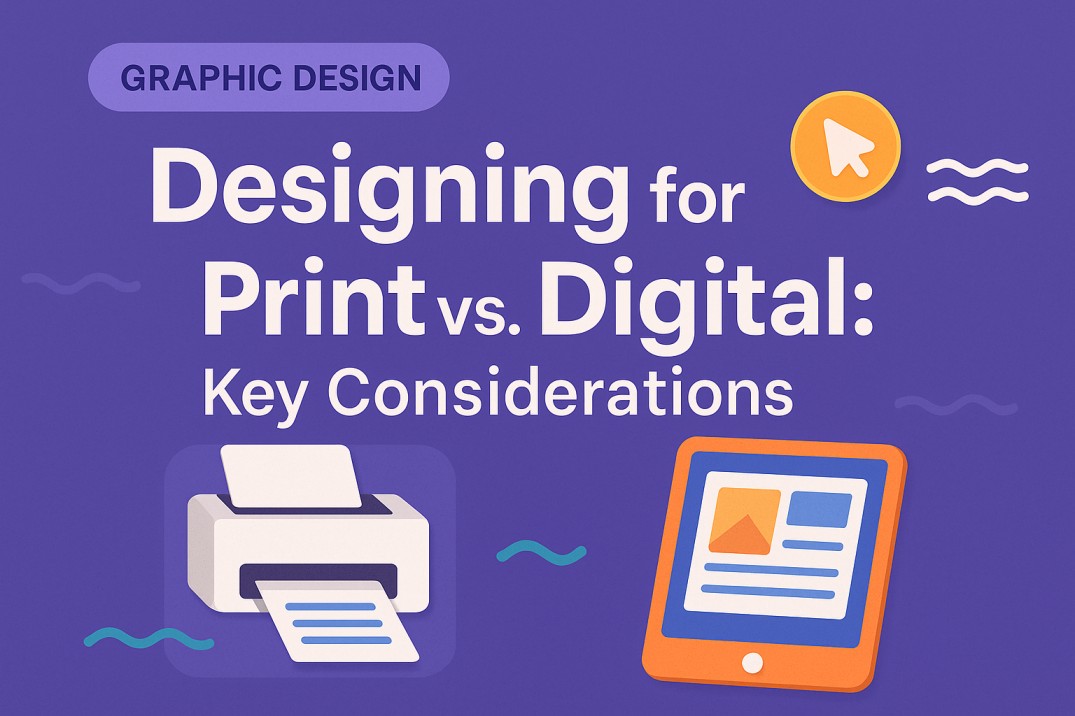
Designing for Print: It’s Physical, It’s Tangible, and It Has Rules
Print design is all about the physical world—flyers, magazines, packaging, posters, business cards. Since it becomes something people can touch, there are technical details that must be considered.
For example, here are some fundamentals you can’t skip:
- Color Mode: Use CMYK (Cyan, Magenta, Yellow, Black). This mode is built for ink printing.
- Resolution: High-res is a must. Aim for 300 DPI (dots per inch) so everything prints crisp and clean.
- Bleed & Margins: Add bleed areas (usually 3mm) to prevent white edges. Keep text inside the safe zone.
- Paper Type: Glossy, matte, textured—the material affects how your design looks and feels.
- Formats: PDFs, TIFFs, or vector-based files like AI or EPS are standard for print.
Print is unforgiving. Once it’s printed, it’s permanent. For this reason, precision matters here more than ever.
Designing for Digital: The Interactive, Flexible Playground
Digital design lives on screens. It includes everything from websites and mobile apps to social media graphics and email banners. Unlike print, it can move, scale, and respond.
Some digital design essentials:
- Color Mode: Always go with RGB (Red, Green, Blue) for screens. It produces brighter, more vibrant colors.
- Resolution: Use 72 PPI (pixels per inch) for web graphics. Higher if you’re designing for retina or 4K displays.
- Interactivity: Think buttons, animations, hover effects, carousels.
- Formats: JPG, PNG, SVG, GIF, or MP4 for animated content.
- Responsiveness: Your design should adapt to different screen sizes—desktop, tablet, and mobile.
Digital gives you room to play and test. You can tweak it, update it, even animate it. However, you need to design for fluidity.
Print vs. Digital Design: A Side-by-Side Look
Here’s a handy comparison table to visualize how differently these two formats operate:
| Feature | Print Design | Digital Design |
| Color Mode | CMYK (for ink) | RGB (for screens) |
| Resolution | 300 DPI | 72-150 PPI |
| File Types | PDF, AI, EPS, TIFF | JPG, PNG, SVG, MP4 |
| Interactivity | None | Clickable, animated, responsive |
| Output | Physical (flyers, books, signage) | Digital (websites, ads, social media) |
| Edits After Launch | Costly or impossible | Easy and instant |
| User Experience | Static | Dynamic and responsive |
Common Mistakes Designers Make
Even seasoned designers slip up when switching between print and digital. Some of the most common blunders include:
- Using RGB color mode for print files (resulting in dull, inaccurate colors)
- Forgetting bleed and margin settings in print layouts
- Designing web graphics with print resolution (which increases load times unnecessarily)
- Using print fonts or formats not supported on web platforms
- Not testing responsive layout behavior across devices
So, avoid these, and you’ll already be ahead of the game.
Why You Should Think in Both Worlds
You might be designing a brand brochure today and a website banner tomorrow. Thus, understanding both mediums means you’re not just a specialist— rather, you’re a design strategist. Here’s why it matters:
- Consistency: Keep your branding cohesive across touchpoints.
- Efficiency: Save time by knowing what works where.
- Versatility: You can repurpose designs for multiple platforms.
- Client Confidence: You become their one-stop creative expert.
Tips to Nail Both Mediums
Want to ensure your designs shine on paper and screen? Then, here are a few field-tested tips:
- Design in Vector First: Scalable and adaptable to both print and digital.
- Always Ask for Specs: Printers and digital platforms have different requirements.
- Create Brand Kits: With color codes in both CMYK and RGB, logo variations, and responsive guidelines.
- Use Grid Systems: They help keep designs structured for print and responsive for digital.
- Preview in Real Environments: Print a mockup. View your design on a phone, tablet, and desktop.
Think Medium First, Design Second
At the end of the day, design isn’t about how it looks— rather, it’s about how it works. And for it to work, you have to consider the medium. A poster isn’t a social ad. A website hero image isn’t a product catalog cover. Thus, knowing the difference is what turns good designers into great ones.
Whether you’re crafting tactile brochures or scroll-stopping social visuals, your design choices should be intentional and informed. Because, that’s the magic combo that gets results.
Need help with print vs digital design? Fuel IT Online has a team of creatives who get the tech and the texture. So, Let us help you bring your brand to life—anywhere it needs to show up.
Let’s design smart, not just pretty.