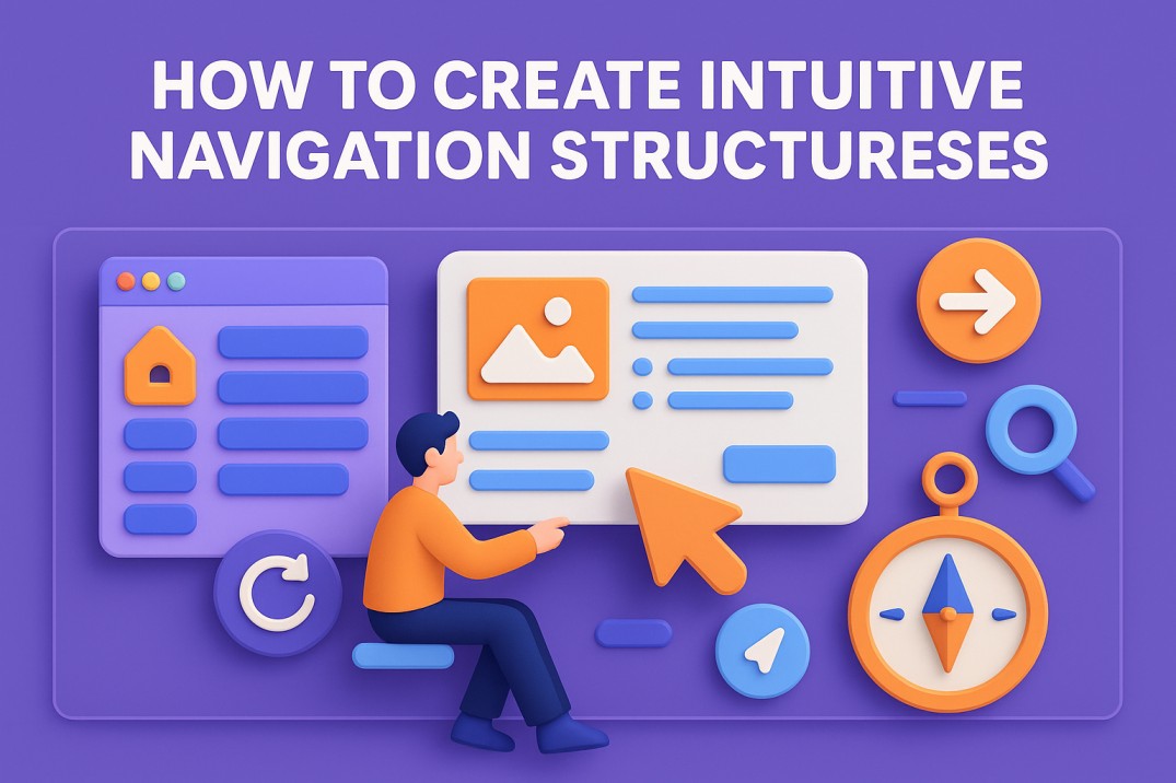
Navigation Can Make or Break UX—If users can’t find what they need on your website in a matter of seconds, they’re gone. In fact, the digital world moves fast, and attention spans are getting shorter. For this reason, creating intuitive navigation structures is non-negotiable. For example, whether you’re running an e-commerce site, SaaS platform, or portfolio, users expect to move through your site seamlessly. In short, navigation is the roadmap of your site, and if it’s confusing, people will turn around.
So, creating intuitive navigation isn’t about stuffing your header with every page possible. Instead, it’s about understanding how your users think, what they expect, and how you can guide them naturally through your content. As a result, the easier it is for someone to explore your site, the more likely they are to stay, engage, and convert.
What Are Intuitive Navigation Structures, Really?
In UI/UX design, intuitive navigation refers to a structured guide that feels natural to users. It means that without overthinking, a visitor can figure out where to go next and how to get there. In essence, it’s rooted in user behavior, consistency, and clarity.
For instance, good navigation acts like a silent guide. You don’t notice it’s doing its job because you never feel lost. The layout makes sense, the labels are clear, and everything flows. However, when navigation isn’t intuitive, users struggle. And struggle means drop-off.
In short: intuitive navigation creates a smooth, frustration-free user experience—which is exactly what every brand should aim for.
Common Navigation Types (And When to Use Them)
Now, let’s talk about formats. Different sites and audiences call for different styles of navigation. So, here are some of the most popular:
- Top Navigation Bar: Ideal for most websites. It usually includes primary pages like Home, About, Services, and Contact. Clean and accessible.
- Side Navigation (Sidebar): Best for content-heavy platforms like dashboards or blogs. Keeps things visible while users explore.
- Hamburger Menu: Popular on mobile and minimalist sites. Saves space but can reduce visibility of key options if not used strategically.
- Sticky/Fixed Navigation: Useful for long-scroll pages or single-page websites. Keeps the nav visible at all times.
- Breadcrumbs: Great for e-commerce or multi-layered sites. Helps users backtrack and understand their location.
Therefore, choosing the right type depends on your content, layout, and user expectations.
How to Design Intuitive Navigation Structures (Step-by-Step)
Building smart navigation doesn’t start with Sketch or Figma—instead, it starts with user understanding.
- Do User Research: Understand who your users are and how they think. For example, what tasks are they trying to accomplish? What language do they use?
- Map Your Information Architecture: Organize your content in a logical, hierarchical structure. In addition, group related items together and prioritize based on user needs.
- Create Wireframes: Visualize your layout before jumping into design. Focus on placement, flow, and visibility.
- Use Clear Labels: Avoid jargon. For instance, use simple, recognizable terms like “Pricing,” “Features,” or “Blog.”
- Test Early and Often: Run usability tests to see where users get confused or lost. Moreover, use tools like heatmaps and click-tracking.
- Iterate Based on Feedback: Navigation is not a set-it-and-forget-it feature. Tweak and optimize over time.
Best Practices for Intuitive Navigation
Now that you’ve got the process, here are some golden rules to follow:
- Keep It Simple: Don’t overload your menu with options. Stick to essentials.
- Be Consistent: Keep navigation in the same location and style across all pages.
- Make It Visible: Don’t hide navigation elements unless absolutely necessary.
- Use Visual Hierarchy: Bold or highlight the current page, and use dropdowns or secondary navs only when needed.
- Mobile First: Design with small screens in mind. Touch-friendly, thumb-accessible, and responsive is key.
The Role of Responsive Design
With more users browsing on mobile devices than desktops, responsive navigation is essential. In other words, this means:
- Menus adapt to smaller screens without breaking.
- Clickable areas are large enough for thumbs.
- Navigation remains consistent across devices.
For example, you may use a hamburger menu on mobile, but keep core navigation items accessible quickly. In short, if users have to zoom, swipe, and guess, they’ll bounce.
The Cost of Poor Navigation
Bad navigation hurts your brand. It leads to high bounce rates, low session durations, and frustrated users who won’t come back. Worse, it sends the message that you don’t understand or respect your users.
On the other hand, brands that invest in intuitive navigation see better retention, more engagement, and higher conversion rates. So, it’s that simple.
Intuitive Navigation Structures: The Backbone of UX
Good navigation isn’t flashy. In fact, it doesn’t need to be. It just works. And when it works, users stick around, explore more, and actually enjoy the experience.
Therefore, if your site feels cluttered, confusing, or outdated, it might be time to rethink how your navigation is working. At Fuel IT Online, we help businesses create digital experiences that are not only beautiful but functional. For example, whether you’re building from scratch or optimizing your current site, we’ll make sure users never feel lost.
Finally, let’s build a site that just makes sense—together.


