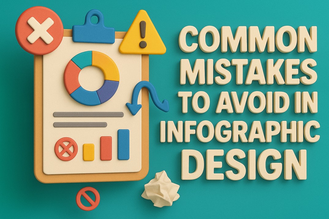
INFOGRAPHICS ARE EVERYWHERE — BUT ARE THEY WORKING?
You’ve seen them. Maybe you’ve even made one. Bright colors, cool icons, some stats tossed in—boom, you’ve got an infographic. But here’s the truth: just because it’s visual doesn’t mean it’s effective. In fact, infographic design mistakes can make them like bad jokes—confusing, awkward, and guaranteed to fall flat.
Moreover, Infographics are booming in marketing, education, and business communication because they distill complex info into digestible visuals. But as more people jump on the bandwagon, design mistakes are becoming more common—and costly. For instance, If your infographic doesn’t hit the mark, your audience won’t stick around to decode it.
So, let’s talk about the design sins we’ve all seen (and maybe committed) and how to do better.
What Makes Infographics Work in the First Place?
Before we tear into the Infographic design mistakes, let’s quickly remind ourselves why infographics are such a powerful format.
- They tell stories visually. Rather than text, people process visuals faster, which makes infographics ideal for storytelling.
- They simplify complex ideas. Through diagrams, charts, and illustrations, you can say more with less.
- They boost engagement. A well-crafted infographic is shareable, snackable, and perfect for today’s scroll-happy audiences.
Now that we’ve set the bar, let’s dig into the common traps that trip designers up.
The Hall of Shame: Infographic Design Mistakes to Dodge
1. Overcrowding the Infographic Design
Why it’s a problem: Trying to say everything at once makes your infographic look like a data dump. As a result, users don’t know where to look or what to retain.
Fix it: Stick to one clear theme or message. Use whitespace as a design tool to give elements breathing room. Less is always more.
2. Poor Color Choices
Why it’s a problem: Clashing colors, too many shades, or lack of contrast can ruin readability and aesthetic appeal.
Fix it: Choose a cohesive color palette that aligns with your brand. In addition, use contrast to highlight key points, and keep accessibility in mind.
3. No Visual Hierarchy
Why it’s a problem: If everything looks equally important, nothing stands out. And, users get lost in the visual noise.
Fix it: Use size, color, spacing, and font weight to guide the viewer’s eye. Headlines should pop. Supporting data should follow naturally.
4. Weak or Misleading Data Visualization
Why it’s a problem: Graphs or charts that distort or confuse the data destroy trust and clarity.
Fix it: Use appropriate chart types. Label clearly. Always keep the integrity of your data front and center.
5. Inconsistent Branding
Why it’s a problem: A beautiful infographic that doesn’t look like you can confuse audiences or dilute your brand presence.
Fix it: Use brand fonts, colors, tone, and logo placement consistently. Every piece of design should feel like it came from the same family.
6. Ignoring Mobile Readability
Why it’s a problem: If your infographic looks great on desktop but breaks on mobile, you’re alienating a huge chunk of users.
Fix it: Design for vertical scroll. Use scalable vectors. And keep the text concise and legible on small screens.
7. Lack of Flow or Structure
Why it’s a problem: Users shouldn’t have to guess where to start or how to navigate.
Fix it: Use arrows, numbering, or section dividers. Think of your infographic like a guided tour.
The Real-World Cost of Infographic Design Mistakes
Beyond just “looking bad,” these design missteps have serious consequences. Misleading charts can damage credibility. Similarly, overwhelming designs lead to low engagement and shares. And inconsistent branding means missed recognition.
As a result, a single poorly designed infographic can cost you trust, attention, and opportunities. In other words, in a visual-first world, every graphic is a chance to impress—or lose interest.
Pre-Publish Check: Review Like a Pro
Before hitting that “post” button, do a quick quality check:
- Read it aloud. Does the message make sense?
- Zoom out. Is the layout clean and flowing?
- Check it on mobile. Is it still readable?
- Ask someone new. Do they get it without explanation?
In short, feedback is your secret weapon. So, use it.
Design Smarter, Not Harder
Infographics aren’t just about pretty pictures. In fact, they’re a mix of storytelling, strategy, and design thinking. Therefore, avoiding the usual pitfalls can elevate your content from forgettable to viral-worthy.
At Fuel IT Online, we don’t just make things look good—instead, we make them work. Our design team crafts infographics that communicate clearly, represent your brand, and resonate with your audience. Whether you need help fixing an old graphic or want to start from scratch, we’re here to help you turn your ideas into visual gold.
So, Are you ready to ditch the design drama and start creating visuals that actually work? Let’s talk.


