In today’s visually overloaded world, where users scroll past content in milliseconds, clean and effective design isn’t just a nice-to-have— in fact, it’s a necessity. For instance, among the most powerful (yet often overlooked) tools in a designer’s arsenal is negative space in design. Also known as white space, negative space in design can elevate a composition from cluttered to captivating, and from chaotic to clear.
What is Negative Space?
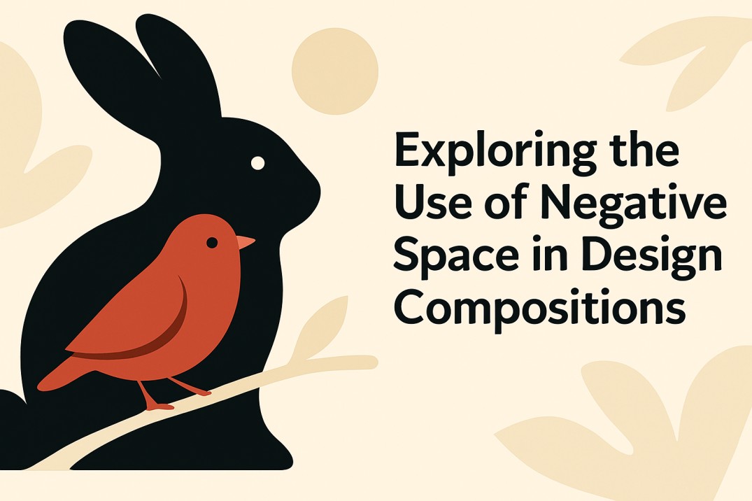
Basically, negative space is the empty or blank space between and around elements in a design. In other words, it’s not just the background— rather, it’s an active part of the composition that helps define and emphasize the positive space (the main subjects or content).
So, Imagine a logo where the letters are spaced just right, or a webpage where the content feels breathable and easy on the eyes. That’s the negative space at work.
Simple examples:
- The FedEx logo uses negative space to hide a subtle arrow between the “E” and “x.”
- A minimalist poster with just a bold message and lots of blank background draws your eye right to the message.
Types: Macro vs. Micro, Passive vs. Active
Understanding the different types of negative space helps you apply them more strategically:
-
Macro Negative Space
- Large empty areas between major layout sections (like spacing between sections on a website or between images and text).
- Helps structure content and avoid visual overload.
-
Micro Negative Space
- Small spaces between letters (kerning), lines of text (leading), or UI elements.
- Enhances readability and improves user experience.
-
Passive Negative Space
- Unused space that exists by default (like margins and borders).
- Helps contain and separate content.
-
Active Negative Space
- Intentionally used to create shape, form, or meaning (like the arrow in the FedEx logo).
- Adds depth and creativity to a design.
Role of Negative Space in Visual Balance and Focus
Negative space improves the overall balance of a composition. For instance, when a design has too many elements packed closely together, the eye doesn’t know where to look.
Strategically placed space:
- Guides the viewer’s attention.
- Emphasizes the most important elements.
- Prevents visual fatigue.
So, whether it’s a social media graphic, a landing page, or a logo, giving your design room to breathe creates a more inviting and professional feel.
How Negative Space Impacts Brand Perception and User Experience
Designs rich in negative space often feel:
- More sophisticated (for example, luxury brands like Apple or Chanel thrive on minimalism).
- More trustworthy (clean design suggests attention to detail and professionalism).
- More usable (users can find what they need faster on a decluttered interface).
On the other hand, designs without enough negative space can appear busy, outdated, or even overwhelming— thus, negatively impacting user experience and engagement.
Designs With vs. Without Effective Use of Negative Space
| Without Negative Space | With Negative Space |
| Cluttered visuals | Clear focal points |
| Poor readability | Strong emotional connection |
| Confusing message hierarchy | Easier navigation |
For example, take two website homepages. As, one is packed with text, buttons, and images fighting for attention. And, the other has breathing room, clear calls to action, and a visual flow. So, which one do you stay longer on? Likely, the second one.
Benefits of Using It Strategically
- Enhances Clarity: Makes your core message stand out.
- Improves Legibility: Text is easier to read and digest.
- Elevates Aesthetic: Clean design feels modern and elegant.
- Supports Storytelling: Focuses attention where it matters.
- Increases Engagement: Viewers are more likely to interact with well-structured, calm designs.
Applications:
- Logos: Use negative space for visual tricks or symbolism.
- Websites: Improve UI/UX by spacing out content.
- Posters: Create dramatic effect with intentional emptiness.
Trends in Negative Space for 2025
As design evolves, negative space in design is seeing new applications:
- Interactive Negative Space: Clickable empty areas in digital designs for engagement (per Creative Bloq).
- Eco-Conscious Design: Minimalist layouts with less visual load for sustainability (per UX Collective).
- AI-Driven Layouts: AI tools like Figma optimize negative space in design for user behavior (per Linearity).
Thus, these trends enhance clarity and user experience.
Tips and Best Practices
- Less is more: Don’t be afraid of empty areas.
- Focus on hierarchy: Use space to group related elements and separate different ones.
- Play with contrast: Use negative space to highlight bold elements.
- Use a grid: Helps maintain balance while introducing space.
- Test and refine: What looks good in theory might need tweaking in practice.
Embrace the Power of Negative Space
Negative space isn’t just the absence of content— rather, it’s a powerful design element in its own right. When used wisely, it can transform your visuals into polished, high-impact compositions that communicate clearly and look beautiful.
At Fuel IT Online, we understand how smart design choices drive brand performance. As our graphic design experts combine creative flair with strategic thinking to craft visuals that not only look great but also convert. So, are you ready to make your brand stand out with the power of design? Then, Let’s build something impactful together.


