Let’s talk about the one feature that users can’t seem to get enough of lately: dark mode design. In fact, it’s sleek, stylish, and feels cooler. For example, whether you’re browsing Twitter at midnight or using your favorite design app, chances are you’ve experienced the magic of a darker UI. However, dark mode isn’t just a passing fad—instead, it’s become a serious consideration in modern UI/UX design. When done right, it can enhance the entire user experience. But when done wrong? In short, squinting at gray text on a black screen is no one’s idea of good UX.
So, what exactly is dark mode, and how can designers use it wisely? Let’s dive in.
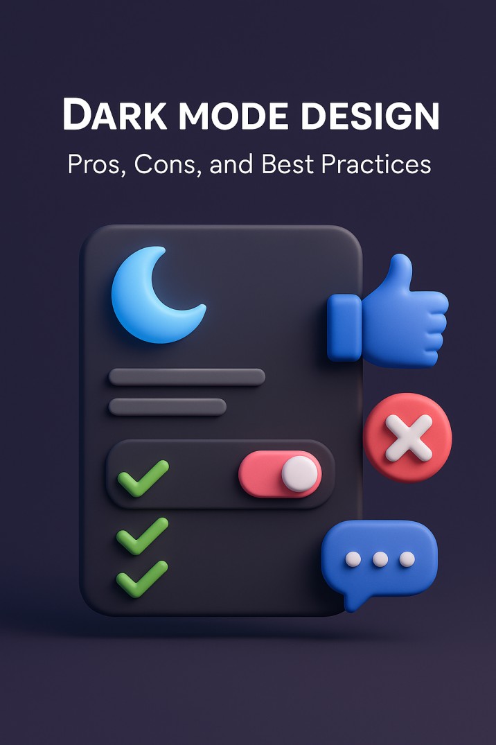
What Is Dark Mode in UI Design?
In simple terms, dark mode is a color scheme that uses light-colored text, icons, and interface elements on a dark background. Think black or deep gray backgrounds with white or muted text. It offers an alternative to the traditional light mode, which features dark text on a white or light background.
Dark mode can be applied across entire user interfaces or offered as a toggle for users to switch between themes based on their preferences or environments. It’s now a built-in feature on Android, iOS, Windows, macOS, and popular apps like Instagram, YouTube, and Slack.
Why Users (and Designers) Love Dark Mode
Dark mode has grown in popularity for a few compelling reasons:
- Reduced Eye Strain: Especially in low-light environments, dark mode can be easier on the eyes.
- Battery Savings: On OLED and AMOLED screens, black pixels are turned off entirely, helping save battery life.
- Visual Appeal: Let’s face it—dark interfaces just look cool and modern. They also make colorful content like photos and videos pop.
- Focus and Minimalism: With less visual noise, users can focus more on the content.
From a design perspective, dark mode opens up creative possibilities for dramatic visuals, moodier branding, and striking contrast. It also aligns with current user expectations—many now consider it a basic feature rather than a nice-to-have.
The Flip Side: Drawbacks of Dark Mode
But before you go repainting your UI in shades of charcoal, know this: dark mode isn’t a magic fix.
One of the biggest challenges is readability. Low contrast between text and background can quickly lead to eye fatigue. Some colors look completely different on dark backgrounds, and what works well in light mode might be jarring or illegible in dark mode.
Accessibility is another major concern. For users with vision impairments or dyslexia, dark mode can actually make content harder to read.
Also, not all brand identities or content types are well-suited for dark interfaces. If your brand is playful and vibrant, a dark theme might feel off-brand or too heavy.
Best Practices for Dark Mode Design
If you’re going to embrace the dark side, do it right. Here are some best practices to keep in mind:
- Don’t Use Pure Black: Instead of #000000, opt for dark gray tones. It’s easier on the eyes and more elegant.
- Ensure Sufficient Contrast: Use tools like WebAIM’s Contrast Checker to ensure text and elements meet accessibility standards.
- Use Color Strategically: Bright colors can look overly saturated on dark backgrounds. Tone them down and test how they appear.
- Test Typography: Make sure text remains readable and comfortable. Consider larger font sizes or increased line spacing.
- Test Across Devices: Dark mode can render differently on screens. What looks crisp on your Mac might look muddy on a budget Android.
- Design Both Modes: If you’re offering a toggle, ensure parity between light and dark modes. One shouldn’t feel like an afterthought.
When (and Why) to Use Dark Mode
Not every app or website needs dark mode, but it can be a smart addition depending on your audience and use case.
- If your users spend long hours in-app (like with coding tools or messaging platforms), dark mode can reduce eye fatigue.
- If your platform is media-heavy (photos, videos, art), dark backgrounds make visuals pop.
- If your brand identity is sleek, modern, or edgy, dark mode can be a great match.
On the flip side, if your audience skews older or your app is heavily text-based, test thoroughly before committing.
Keeping It On-Brand
Dark mode doesn’t mean abandoning your brand identity. In fact, it can be an opportunity to reinterpret your brand colors, tone, and personality. Develop a dark version of your design system. Adapt your logo, refine your color palette, and make sure you’re still recognizably you.
Consistency across light and dark modes is key to building trust and a cohesive experience. Don’t let one version feel neglected.
Balance Is Everything
At the end of the day, dark mode is about giving users choice and comfort without compromising on usability or design integrity. It should enhance the experience, not just follow a trend.
Whether you’re redesigning a mobile app, building a brand-new website, or fine-tuning a dashboard, thinking about how your product looks and feels in dark mode is no longer optional—it’s expected.
At Fuel IT Online, we help brands design experiences that work for real people, across every mode, device, and platform. Need help making your dark mode look dazzling? Or not sure if it’s right for your brand? Let’s talk.
Good design doesn’t just look good—it works everywhere.


