Let’s be honest—the internet is full of websites that look and feel exactly the same. For example, you know the ones: predictable layouts, generic stock photos, and that same old “Contact Us” button floating in the top-right corner. However, every now and then, a unique website comes along that feels like an experience. As a result, it pulls you in, speaks to you, and leaves a lasting impression.
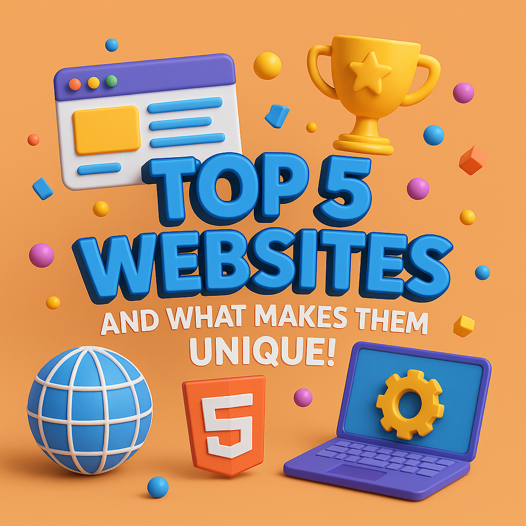
In this blog, we’re diving into top 5 websites that break the mold. They don’t just look good—they feel good. In fact, whether through bold visuals, seamless navigation, or story-driven interactivity, these top 5 websites are redefining what it means to engage online.
So, grab your favorite snack and get ready to explore what truly makes a website wow-worthy.
What Makes a Website Unique
Before we geek out over our top 5 websites, let’s talk about what elevates a website from decent to unforgettable. In essence, a great website strikes a balance between form and function. For instance, it should:
- Deliver a seamless user experience (UX)
- Reflect the brand’s personality and purpose
- Be visually innovative without compromising usability
- Leverage interactivity and storytelling
- Adapt beautifully across all devices
Now, let’s meet the overachievers.
1. Apple (apple.com)
The Brand: You already know Apple. Sleek devices, minimalist vibes, and a cult-like following.
The Design Magic: Apple’s website is the perfect reflection of its brand. It’s clean, minimal, and incredibly intuitive. For example, every product page feels like a cinematic experience—with full-screen imagery, smooth scrolling, and subtle animations that bring the hardware to life. Moreover, there’s zero clutter, yet zero confusion.
Takeaway for Designers: Less is more—but only when every element has a purpose. In other words, Apple shows us that whitespace, hierarchy, and precise typography can create a premium user experience.
2. Spotify Design (spotify.design)
The Brand: Spotify’s design team created this hub to showcase the thought process behind their product design.
The Design Magic: Spotify.Design is a playground for the curious. Specifically, it combines bold colors, playful typography, and editorial-style layouts to tell stories about their creative process. Additionally, each section feels dynamic yet readable, giving insight into the brand’s human-centered approach.
Takeaway for Designers: Use your site as a storytelling tool. Therefore, give visitors a reason to explore and feel connected to your design thinking.
3. Awwwards (awwwards.com)
The Brand: A global platform that celebrates the best in web design. Basically, where designers go to drool.
The Design Magic: Meta, right? A website that showcases great design is great design. For instance, Awwwards strikes a balance between showcasing stunning sites and maintaining usability. In addition, it uses grid layouts, hover animations, video previews, and smart filtering that make discovery a joy.
Takeaway for Designers: Balance visual inspiration with practical UX. In short, functionality doesn’t have to kill creativity.
4. Airbnb (airbnb.com)
The Brand: A global marketplace for short-term rentals and experiences.
The Design Magic: Airbnb combines functionality with emotional design. For example, their homepage evolves with seasons and trends, using vibrant photography, subtle micro-interactions, and inclusive design language. Meanwhile, navigation is smooth, and each listing page is a well-thought-out UI kit of its own.
Takeaway for Designers: Make your users feel something. In other words, empathy, personality, and detail in design help users trust and enjoy your platform.
5. Stripe (stripe.com)
The Brand: Stripe provides online payment processing for internet businesses.
The Design Magic: Stripe’s site is the holy grail of B2B web design. It’s professional without being boring, technical without overwhelming. Moreover, animated diagrams, clean code snippets, and high-contrast UI elements bring complex ideas to life with clarity. As a result, even non-technical users can understand their offerings.
Takeaway for Designers: Don’t be afraid to educate through design. For instance, motion, spacing, and clear hierarchy can make even the nerdiest content digestible.
What These Top 5 Websites Have in Common?
These top 5 websites may serve different industries, but they share a few critical traits:
- A strong brand presence and tone of voice
- Design consistency across pages
- High performance and responsiveness
- Purposeful use of animation and media
- An obsession with user experience
In short, these to 5 websites don’t just inform—they inspire.
Want to Build a Website That Stands Out? Here’s How:
You don’t need Apple’s budget or Spotify’s team to create something incredible. Instead, start here:
- Tell a story: Guide users through a journey.
- Design for humans: Accessibility and empathy matter.
- Don’t fear whitespace: Give your content room to breathe.
- Make it move: Thoughtful animations can elevate interaction.
- Test often: What works on paper might flop in practice.
Ultimately, every brand has a story. Thus, great design helps people feel it.
Why Web Design Is Your Brand’s First Impression
Your website is often your first hello to the world. It’s your handshake, your vibe check, your elevator pitch—all rolled into one digital space. Therefore, when done right, it doesn’t just look good; as a result, it connects, converts, and leaves a mark.
At Fuel IT Online, we specialize in creating sites that go beyond templates. For example, whether you need bold branding, seamless UX, or scroll-stopping visuals, our team brings ideas to life with precision and personality.
Finally, ready to make your brand unforgettable? Let’s design something exceptional together.